Design
Template created by DeviantDesigns

About Me
Where the love for comicbooks and acid tongued sarcasm comes together.....the two great tastes that taste great together!!
Navigation
Archives
March 2005 April 2005 May 2005 June 2005 July 2005 August 2005 September 2005 October 2005 December 2005 March 2006 July 2006 August 2006 March 2007 April 2007 May 2007 July 2007 August 2007 September 2007 October 2007 November 2007 December 2007 May 2008 June 2008 July 2008 March 2009 June 2009 December 2009 September 2010 December 2010 February 2011 March 2011 April 2011
Previous Posts
A Quickie
The Return of Da King.
The Dark Knight
Green and Mean
New and old
'Twas the Knight Before Christmas...
~23rd Birthday~
It is Officially OVER.After 1 and 1/2 months of ex...
Mundanely yours....
Clowning around
Welcome one and all to my Annual Christmas Blog post......Its been God knows how long since my last post.....but I'm back for a special entry.... The Ticks and asterixes were added over the many months to help me keep track of the outstanding and completed pages.
.
I thought that it would be interesting to provide a behind -the-scenes look at how the Anthology of vignettes I gave for Christmas was put together over a year-long period....you know...like a sort of Director's commentary on this project that nobody asked for...lol
.
THE GENESIS
Let's start with the Genesis of the project; It was December last year when I started putting this project together.....I was job-hunting and since who knows how long it would be till I got myself a job in the midst of the Economic Crisis.....I decided that to prevent myself from being discouraged, depressed and frustrated with the whole job-hunting process....I needed to somehow focus myself mentally and physically....
Besides exercising daily and going to the gym a few times a week....I of course went back to what I had loved doing most; Drawing funnybooks......normal folks don't know what a mentally stimulating process it is to do a comic.........so many problems to solve when staring at a blank page; How to tell a story that flows visually, how to get a character from point A to B, how many panels to have on a page, which areas of the drawings should be grey-toned for more visual impact.....and how to get the images in your head and translate them onto paper....
I thought what the heck, I have some free-time between job interviews....so let me just flex some of my old muscles and draw a short story to see how much I have improved....
I decided to do A spaghetti Western featuring Jonah Hex (Soon to be in a movie starring Josh Brolin and Megan Fox)......The sory is completely wordless except for a quote at the beginning because the whole point was to teach myself how to tell a story visually without the aid of words.....
I watched some of my favorite Western films; Unforgiven, The Good, the Bad and the Ugly to prepare for this project, did my research on the canadian mounties and 18th Century revolvers and wrote a pretty detailed script that broke down the story beat for beat.....
Long Story short.....I actually completed all 6 pages and completely fell in love with drawing again.....
It's been a fantasy of Mine to put together a collection of my artwork since I was 15 years old and making my own mini-comics using My Dad's fax machine.....I kinda knew that since I was going to be starting my worklife soon that putting together a collection of artwork together would probably just remain a childish fantasy....
Then Something clicked for me....It was also around Christmas 2008 at that time and for that year I didn't give anyone any drawings or cards or anything like that, so I decided that I was going to do something special for Christmas 2009....
I would put together a year-long project.....to draw all new stories, complete some old stories, draw new pin-ups and basically collect every piece of animated style art I've done between 1999 and 2009 in a book completely designed by me....and that I would promise myself to work on this even after I got a job...
There would only be 5 copies printed for each of the five of us.....not a copy more and none of the vignettes and artwork would ever see print again........I thought that would be a fantastic gift, as personalized and exclusive as It'll ever get.......and that It would KICK THE ASS of Candy's puny Valentine's day Card in terms of effort and complexity.....
I gave myself exactly A Year to put this together....and thus It Began:
.
THE INITIAL PLANNING
By late January 2009, I had finished Drawing my Jonah Hex story and revised my script to the story. In the interim period I had been thinking about the structure of the whole Book and the stories that I wanted to put together......how they fit...
I thought about this long and hard during bus rides to and from my house and some downtimes during my weekend......I let it stew in my head and by March 2009, I had the whole structure of the book and the order of the pages and story in my head.....and I would mentally go through it regularly.....
On the First week of April, the week I started my job, I spent about 30 minutes drawing small thumbnails of the whole book on two sheets of A4 paper....it was relatively easy since the whole structure had been in my head for months..
.
The scans of those two pages are below .
. It should be noted that I was going to draw a two page Origin of Two-Face for the collection but decided to add in more new pin-ups and generally finish up all the additional art needed to tie the collection together.
.This checklist of thumbnails was immensely helpful to me in putting this project together and really helped me visualise the whole thing as one entity instead of dozens of seperate pages.
.THE BREAKDOWN.I'll be giving some short comments of the various sections on the whole book in this section:.The Book basically Breaks down into 4 main sections: 1.) The main Stories, 2.)The Oddities, Dabblings and Other Miscellany, 3.) The Scripts , 4.) The Sketches and 5.) Christmas 2009: Dedications and Well-wishes.....
.Most of the stories in the collection are not to be taken too literally as a long-form stories with a beginning, middle and end.......they're merely vignettes that I came up with to explore my favorite genres and give me an excuse to draw cool stuff like monsters, abbes, city scapes,etc...
.ok here we go:
.1.) Front Cover:
.I wanted a more sturdy paper stock to house the contents of the book in, so I went to Popular bookstore during one of my lunchbreaks and selected a paper with the right texture and thickness I wanted. Needless to say....Of course it would be black....
.I then went to a Sticker Fabricating shop in Bras Basar to obtain the fabircated Dark Knight Logo stickers. They were hand-pasted at exactly 6.5 cm from the top of the page and at the Head of the bat is attached at the 10.5cm mark of the page; which is the centre of an A4 page.
.The Fake Barcode at the back was modified to have the words GTM CTY in them. Just an additional touch of geekiness. They were the last things to be pasted on the finished book.
.2.) Inner Cover:.I dug up some 1930's reprint of Detective comics where Batman first appeared and did my best to replicate the same font and lettering by hand..Just my own Sardonic Brand of Humor; modifying it to "Defective comics".
.There are 3 "E" s in "DEFECTIVE" and if you notice, they actually look all the same. After I had lettered the Font by hand, I realized the I only liked how the first "E" looked, so I photocopied two copies of the title, cut out the first "E" from both copies and pasted them over the 2nd and third "E"S, so that they would look right.
.The corrected version was then photocopied in high resolution and I drew Batman onto the Cover and lettered in the 10 cents sign.
.3.) Odds and Ends Title splash
.As a design element I wanted a Two Page Splash of Gotham city to open the book and I wanted to incorporate the name of the Anthology : "Odds and Ends" into part of the city scape....You can see Baman over the city, framed by the moon on the right side and this was a conscious choice since I wanted this two page splash to somehow segue directly into the first story. So in actuality, Batman is bounding across Gotham city in this opening titles and by the first story he's already made his way to the Gotham Harbor.
.That's why there was no Title Card and intro to my first Batman story, I didn't want to break the flow..Because the drawing was in A3 and had to be folded; when the book was binded, the page before you see the 2 page splash would have been blank, So I drew up a dedication to Wenjun, Huiling, Geraldine and Felix and hand-pasted them over the 5 photocopies....to get rid of the blank page..4.) Bruce Wayne's Pledge to his Parents.I wanted to kick off the story with Batman's famous pledge to his parents. I love the idea of drawing a snap-shot in time of a 9 year old kid, kneeling by his bed under the candle light, making a vow to his dead parents and making a decision that altered the rest of his life..5.) Batman: THERE BE MONSTERS!.This was the last story I drew for the collection and features my best work ever. The Art was done in a combination of Ink Wash, HB Pencils, Pigment Markers and White paint..Each Page took me 1 week to 1 1/2 weeks to draw. I would pencil and ink one panel a day between 9.00pm to 12.30am after I got off work, leaving the bigger panels for the weekends (burning quite a few staurdays). I did this for about 2 over months, seldom missing any deadlines set and I finished it before my trip to Taiwan..I did not have an introduction or title card for the story because like I said I did'nt want to break the flow.
.The whole concept of the story is this: Some People believe that Cities or Buildings are actually living Urban organisms that have a unique rhythm, life and pulse to them that differs from city to city.....What if Gotham City was like this sentient organism, that corrupts good innocent people and transforms them into crazed criminals and psychopaths? A city so corrupt that you'll be taking you life into your own hands by walking down the streets at night.....It's like some Psychopath-manufacturing Urban factory that sucks good people in, soils them and vomits them out.
.If that were the case, then When Batman puts on his cape every night; he is not taking on Criminals and Gangsters....He's Taking on the Whole City. An anti-body in a Rotting Urban system fighting for his sanity and trying not to allow the city to corrupt him and turn him into another of the monsters he's been fighting..You'll have to read the captions to kinda semi-grasp the premise of the story. If You read the dialogue alone, the story doesn't really makes sense at the end..Anyway the story basically goes like this: Batman arrives at Gotham Harbor to prevent Madam X from poisoning the city with her Hallucinogens, from his internal narration its clear that he thinks of Gotham as this evil place that transforms normal people into monsters and freaks, he gets hit by Madam X's hallucinogens and as a side-effect he starts seeing the whole city literally the way he imagines with Everybody literally becoming monsters..So great is his force of will that he beats the hallucinogens, grabs Madam X and is about to choke the life out of her in his drugged up state but he regains his faculties and releases her.
.Once again, this corrupt city and its denizens have failed to make him cross the line and break his tenet of not taking lives......what seperates Batman from other costumed criminals is that he won't sink to their level and won't kill no matter how the city and situations test him..The Last few Panels of him lying flat on his back, exhausted from the drugs is a very abstract ending that I'm sure no one but me understands...My Mum was puzzled for sure...LOL!....Basically when Someone has a near death experience and wakes up from it alive; the air is sweeter and somehow tomorrow is going to be a beautiful day........So Batman collapses in exhaustion after the ordeal and you can see a nice serenity washing over him as he smirks to himself, enjoying the night sky above.......that cocky smirk is basically him looking up and telling the city: "Nyah, Nyah, Nyah, Nyah, Nyah......You didn't get me tonight...try Harder Next Time!!
.Of course there is always tomorrow night again.....night after night Batman fights for his own soul and sanity in a city full of freaks...and I imagine...one day the city is going to get to him....6.) Catwoman: Pussy Cat and Batman: Going To Work Pin-ups:.Both of these were old Pin-ups done around 2004.....The Catwoman one in particular was drawn using a fat marker and hasn't aged too well.....7.) Hex, Death Be Thy Name.I believe the One page intro to the story sums up everything well. If You have gone through the story and understood what is going on in the pictures from panel to panel even without the dialogue, Then I've done my job.
.The script for this story was included in the back of the book, to give you an idea of How I break down a story in Long-form, especially for silent stories which needs to be broken down to the minute details because you have no captions or dialogue to rely on..8.) Old Fake Advertisments:.There are Three advertisements in the book, The Car one is an authentic ad, the other two were taken from old comics, scanned in and touched up and edited....intended to be parody of Actual advertisements that used to run in the 60's/70's comics like those old advertisements on Mail-ordering Sea-monkeys and the famous Charles Atlas Body-Building ad found here:..9.) Human Values.My Favorite Story.
.I thought there was a meaningful point made in this story. I finished the first 2 panels in 2001 and completed the other few few panels in 2009 after I finished the Western story.. I've always wanted to finish it up and I'm glad I did..10.) Heart to Heart.I had this image of Superman hanging out with a Polar Bear in the south pole....like those in a Coca-cola advertisement..Its kinda cute, its kinda bizarre and it highlights just how solitary an existence a man with the weight of the world on his shoulders, leads..11.) Trinity.Probably one of the more ambitious stories in this collection, Spanning over 30 years from the dawn of the atomic age, World War 2 to the Korean War......The First 3 page framing sequence was first drawn in 2004 and sets up the political and social climate that necessitated the alliance beween Wonder Woman, Superman and Batman:
.The Next 3 pages was drawn in 2009 and is a "fly on the wall" sort of moment where we are privvy the the beginning of the alliance and friendship between the 3 of DC's greates heroes..I love inserting fictional characters into real-life events; it creates endless story possibilities..12.) Origin of The Joker
.A 2 page vignette that was my attempt at storyboarding the Joker's transformation sequence from the Red Hood into the Clown prince of Crime..It was during this story I believe that I switched to the 0.03mm Multiliner pen for inking; which I believe is the finest and sharpest pen nib ever manufactured. It was quite a chore to try to master such a fragile and delicate pen.
.I wanted the story to be a B&W/ Monochromoatic world and for the Red Hood to be the one character/color element that really pops out. So I handcolored all the final Photocopied pages with a Red Prisma Color Marker.
.13.) May The Floss be with You. I actually did not want to include this story due to how crude the art was but I decided to include it in the end for the sake of being complete.
.It also kinda shows my artistic progression over the 10 years. I believe this 7 page story was drawn back when I was in sec 3 and had No idea what tools were used for inking.
.14.) A Date with Bruce Wayne
.A short 3 page, wordless story that I had in mind for quite a while, I actually used the story and recycled it was a 3 part triptych advertisement for one of my University projects on Wine Bos.
.That's why there is so much space at the bottom of each page. I had wanted to insert some of my marketing Taglines in each page..The 3 pages were done in a rush...I think within a day..15.) Dini the Meanie
.A strip where a demented kid tries to kill his pet Hyena in every installment. Obviously a parody of Calvin & Hobbes and Dennis The Menace..I did this for the sheer heck of it while trying to play around with newspaper comic strip format..16.) The Scripts: Hex, Death Be Thy Name
.I included this because I beleive it sheds a little light on the 6 page silent story included in the earlier part of the collection, plus it does kinda give some insights into my thought processes when I concact a story.
.This is a Long-form script with very detailed breakdowns. Normally I don't work this way, I prefer more spontaneity so I usually handwrite bits of dialogue and scribble thumbnails of each page and then refine the dialogue when I letter it in..Very rarely is there a completed script. I think I've only done long-form scripting only 2-3 times..17.) Sketches:
.My favorite part of drawing is the sketching and doodling; where the art doesn't have to be polished,where you draw anything you like and where you work out how you want to portray characters visually...
.I really had fun drawing the third page of doodles in particular; the Adam west Batman from the 60's TV show, Joker and Harley Quinn fooling around in their twilight years (I was watching Adam Sandler's Wedding Singer when I drew it I think...
.And If you notice...I like some of the sketches so much that I included them in some finalized art pages......A less goofy version of The Catwoman & Batman sketch was used as one of the Christmas Ornaments in the A3 christmas Drawing....
.I also had my breakdowns for one of the pages of my Batman story printed on tracing paper and overlayed on the final page to give a glimpse of how the art work evolves from rough breakdowns to the final art and how the placement of characters have to be all worked out beforehand.
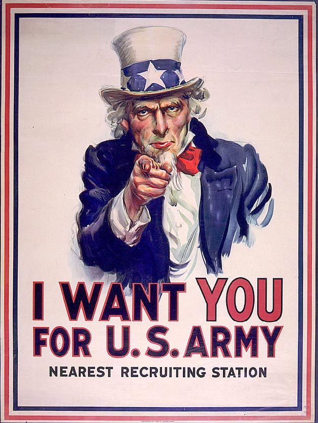
.18.) Batman: After Uncle Sam, Catwoman:Repose, The Princess and The Frog and Joker: Santa Clown Pin-ups:
.The Batman Pin-up was a breeze to draw and it is of course a throwback o the World war 2 "WE WANT YOU!" Uncle Sam Poster found here..I like the Catwoman Pin-up a lot......especially the eye-lashes....Selina Kyle in a rare moment of contemplation....The Princess and the Frog is my favorite pin-up....It has more whimsy and Life than May of the other pin-ups. I love drawing frogs and I love the Mature readers title that DC puts out called "Fables" that deals with Fairytale characters.
.Lastly, for the Joker as Santa pin-up ; if you look at the botton right, you'll see that there's this small expoding snow ball that has hit the roof.
.That was actually a mistake; I spilled a big drop of white paint on the drawing while using the toothbrush to spray on all the white specks of snow....so I had to use my brush and create this spontaneous looking mass of exploding snow out of the drop of paint. I kinda liked it in the end though.
.19.) Christmas Dedications and Well-wishes:.I Thought it was weird to just give a collection of comic stories for Christmas so I decided to have a Christmas themed section that oddly enough integrated various Comic characters that appeared in some of the stories earlier on.....to kinda provide some thematic link.
.The first page would be a framing page that explained why was this project put together and it would lead to a big A3 flip out pster that had all our pictures integrated into it.
.The first page drawing was kinda based on the Valentine's Day Card drawing For Candy in terms of layout, where it that lead your eye fro the top left of the page to the bottom right.....
.Here's a scan of the drawing at 400 DPI :
. .Next We get to the Centrepiece drawing of this whole Collection: The A3 christmas Drawing. I knew I wanted to incorporate photographs of our group into a 2-d Comic type drawing and luckily I stumbled onto the idea of including our group/individual photographs as Ornaments on a Christmas Tree.
.Here's how the drawing was created:
.1.)I started by choosing some of the Indiviudal and Group photos that I wanted to include in the drawing and I cropped them digitally using a Spherical cropping tool.
.They were printed on sheets of A4 paper because I wanted to have a sense of scale of how big the circles were, in proportion to an A3 Page.
.
The Bigger Ornaments were then Indivually cut out and pasted on An A3 Sized sheet of Drawing paper
. Step One:The Bigger Ornaments were first carefully laid out and pasted on the blank sheet of A3 paper
. Staring helplessly down at a very empty sheet of paper that needed filling in...LOLNext I wanted to work out the placement of the Comic Character Ornaments that would be drawn onto the page and integrated with the Photo-Ornaments..
Since there was no way I would be able to hand-draw symmetrical looking ornaments , I folded sheets of paper in Half, drew the shapes of the ornaments onto the folded paper and cut it out, thus getting perfectly symmetrical shapes..These shapes were then placed on the A3 paper and I would hand-trace their shapes onto the area I wanted them to be.. These are the Ornament Cut outs that I used to help me get the symmetrical shapes I wanted.Once All the major Ornaments had been pasted or laid out in Pencil on the Page, I started pencilling all the details in, around the ornaments.
 This is the half-completed Pencil drawing that took one saturday to layout and draw. .If You notice carefully in the picture: In order to blur the lines between what is drawn on page and what is pasted on, I pasted a Circular Ornament that overlapped Huiling's picture; her name would be subsequently lettered in by hand..
.
The whole thing took about three days to pencil; The 17th,18th and 19th Of December. This is the fully penciled A3 Artwork with the smaller Photo ornaments now pasted in. .Once the drawing has been completed in pencil, its time to ink the whole thing and add in all the black areas. We start by "spotting blacks"....which is the process of identifying areas that are to be covered in shadows to make various parts of the drawings pop in the final art.
 This is the Partially Inked page, with the majority of the shadows and feathering already in the drawing..One of the most tiring things to do was feathering.....the feathered edges are all the edges of the black areas that are really finely inked and look like brush tips or fur.....Basically to do feathering, I ink all the edges of the black areas with a very fine 0.03 pen, then I slap in large chunks of the black with a fat waterproof marker, the thickness of the marker strokes does not blend in with the finely feathered edges, so I use a o.o5 pen to kinda of blend the areas between the fine lines and the thick marker strokes. I then come back in with the 0.03 mm pen and do the final feathering which involves me scracthing my pen on the edges of the black areas until the edges are razor sharp and the areas of black are completely blended together.
.The problem is that the feathering requires my hand to zig-zag across the area rapidly to blend the black areas and create razor sharp lines and this takes forever to do. And the rough texture of the A3 paper absolutely kills my delicate 0.03 pen......You feather non-stop for an hour on the rough paper and I guarantee your 0.03 pen nib would be worn down to nothing. . I killed 3 pens working on this drawing and They cost $7.95 a pen.....LOL!.. This is a close-up shot of some of the details from the drawing. Yo can see the Feathered black edges.Next I had to think of what drawings to fill up the Comic-related ornaments with; so I decided to depict some of the comic characters sharing in some yule tide joy; Catwoman about to Kiss a smirking Batman under the Mistletoe, The Joker pinching Harley Quinn's cheek affectionately and Wonder Woman shedding her battle armor for a more festive look....Finally I lettered all our individual names in the Circular ornaments, finished drawing the small ornaments (The star-patterned one was created using a Star-shapped cut-out stencil, a Toothbrush and white paint).A ribbon was also cut out and pasted onto's wenjun's ornament to further blur the lines between what is drawn or pasted onto the A3 page.
. The Final Inked drawing took another 3 days to do: 20,21st,22nd of December..I started on this drawing on the 17th, sleeping at 5 am that day and continued throughout the weekdays from 9pm to 2am every day, till the 23rd of december where I slept at 5am writing out all the personalized messages and grey-toning the whole drawing..The grey-toning is aboslutely necessary to give more dimension to a drawing and also to help differentiate/highligh tbetween the areas. Before the Grey-toning, the Christmas tree areas and the fluffy streamers were all in white, but after I grey-toned the whole drawing, its quite obvious the Christmas tree areas were the darker, grey-washed areas..
 The Final, Ink-washed Drawing scanned in at 400 DPI to be colored by Photoshop..BUT Wait I was still not done yet, I love the drawing in Black,white and grey but I thought that this particular drawing needed some color to make it look more festive..I didn't want to risk ruining my drawing that took me days to do by coloring directly onto the drawing.. So I got a crash-course in photoshop and digitally colored the Ornaments in the Drawing to pop them out from the grey background..
 My First attempt at Coloring in Photoshop. Not too Bad, Not Too Good either.
.
My 2nd attempt with all those Photoshop special effects thrown in.
.
I wanted to fill in the grey areas with green but it made the whole drawing look really patchy and over-colored and due to all the intricate lines I filled the page with, the Magic wand function and the Magnetic lasso function was not precise enough and there was a lot of bleeding.
.
So I thought what the hell I'll just do it the old fashioned way and colored a High Resolution laser photocopy of my Grey-toned drawings using this really great but expensive Water-proof Color Pigment ink Pro Markers (Another $40 bucks down the drain) on the 24th Dec morning.
.
Finally in the afternoon of 24th Dec I went to the binders to get my book binded and My A-3 colored drawings printed on High-quality Poster paper in Bras Basar Complex....
.
I realized that I had left out the Joker's Purple jacket, so I went to Art-friend and bought another promarker and went around finding a place to color the small bit........couldn't find no seats so I just went to the Cetntral Library...while in the toilet cubicle, I saw a nice flat raised Ceramic top that covered the Toilet's water cabinet....I placed the drawing onto the ceramic top, colored the thing in under a minute and got the darn thing printed....
.
I went to Artfriend to walk around a bit while they printed the posters and saw them selling small bags of googly eyes, so I bought a pack and out of the blue decided to glue them onto the Gingerbread man's eyes on the poster
.
When I finally got the Binded books and the Printed posters in my hands, I literally felt like I just finished running some long-ass marathon........
.
 The Folder full of printed pages that were rejected by me due to a variety of reasons from wrong font types to wrong tone of the grey wash reproduced. There's more than a 150 pages in this folder.
 I have a Zip-lock bag that I call my "Graveyard of Pens" that contains Every Pen and Marker I've used up over the course of this past five years; Almost half of them were Killed in Action while putting together this project. RIP my friends...You've all served me well....LOL
.
MERRY CHRISTMAS AND HAPPY HOLIDAYS FOLKS!!